
Sam Richard
@Snugug
BBQ lead, ChromeOS DevRel. Mostly food, sometimes design and development, especially for the web. 7008px tall. He/him.
An archive of my Twitter timeline up until I moved to Mastodon. You can find me there at @[email protected]
This is what I’ve been doing w/the charting stuff; adding data viz to a little health PWA I’ve been building for myself. Donut charts, left to right, are below min, slightly above goal, above 2x goal, above goal, and within goal (water is blue, otherwise green). (1/2)
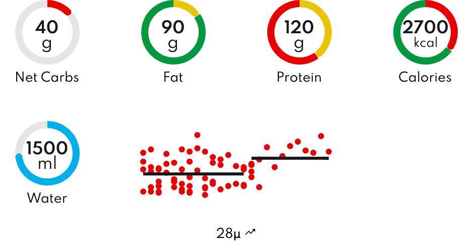
Scatter chart is past 28 days of data, grouped by day, then grouped into two 14-day segments with an average for each group, and a description showing if it’s trending up or down.
The ~140kb of JS was tough for me to include, but the data viz is already super useful, so it stays